css 语法
1、定位的组成
定位:将盒子定在某一个位置,所以定位也是在摆放盒子,按照定位的方式移动盒子。
定位=定位模式+边偏移
定位模式:用于指定一个元素在文档中的定位方式。边偏移则决定了该元素的最终位置。
1.1、定位模式
定位模式决定元素的定位方式,它通过 css 的position属性来设置,其值可以分为四个
| 值 | 语义 |
|---|---|
| static | 静态定位(默认值) |
| relative | 相对定位 |
| absolute | 绝对定位 |
| fixed | 固定定位 |
1.2、边偏移
边偏移就是定位的盒子移动到最终位置。有 top、bottom、left、right 这 4 个属性
| 边偏移属性 | 示例 | 描述 |
|---|---|---|
| top | top:80px | 顶端偏移量,定义元素相对于其父元素上边线的距离 |
| bottom | bottom:80px | 底部偏移量,定义元素相对于其父元素下边线的距离 |
| left | left:80px | 左侧偏移量,定义元素相对于其父元素左边线的距离 |
| right | right:80px | 右侧偏移量,定义元素相对于其父元素右边线的距离 |
1.3、静态定位 static(了解)
静态定位是元素的默认定位方式,无定位的意思
语法:
选择器 {
  position: static;
}- 静态定位按照标准流特性摆放位置,它没有边偏移
- 静态定位在布局时很少用到
1.4、相对定位 relative(重要)
相对定位是元素在移动位置的时候,是相对于它原来的位置来说的(自恋型)
语法:
选择器 {
  position: relative;
}
相对定位的特点:(务必记住)
- 它是相对于自己原来的位置来移动的(移动位置的时候参照点是自己原来的位置)。
- 原来在标准流的位置继续占有,后面的盒子仍然以标准流的方式来对待它(不脱标,继续保留原来的位置)
因此,相对定位并没有脱标,它最典型的应用是给绝对定位来当爹的(子绝父相)
示例代码展示:
<!DOCTYPE html>
<html lang="en">
  <head>
    <meta charset="UTF-8" />
    <meta http-equiv="X-UA-Compatible" content="IE=edge" />
    <meta name="viewport" content="width=device-width, initial-scale=1.0" />
    <title>Document</title>
  </head>
  <style>
    .box1 {
      position: relative;
      top: 100px;
      left: 100px;
      width: 300px;
      height: 300px;
      background-color: pink;
    }
    .box2 {
      width: 200px;
      height: 200px;
      background-color: deeppink;
    }
  </style>
  <body>
    <div class="box1"></div>
    <div class="box2"></div>
  </body>
</html>
1.5、绝对定位 absolute(重要)
绝对定位是元素在移动位置的时候,是相对于它祖先元素来说的(拼爹型)
语法:
选择器 {
  position: absolute;
}
绝对定位的特点:(务必记住)
- 如果没有祖先元素或者祖先元素没有定位,则以浏览器为准定位。
- 如果祖先元素有定位(相对、绝对、固定定位),则以最近一级的有定位祖先元素为参考点移动位置。
- 绝对定位不再占有原来的位置(脱标)
1.6、子绝父相的由来
弄清楚这个口诀,就明白了绝对定位和相对定位的使用场景
这个“子绝父相”太重要了,是我们学习定位的口诀,是定位中最常用的一种方式,这句话的意思是:子级是绝对定位的话,父级要用相对定位。
- 子级绝对定位,不会占有位置,可以放到父盒子里面的任何一个地方,不会影响其他的兄弟盒子
- 父盒子需要加定位限制子盒子在父盒子内显示
- 父盒子布局时,需要占有位置,因此父亲只能是相对定位
这就是子绝父相的由来,所有相对定位经常用来作为绝对定位的父级。
总结:因为父级需要占有位置,因此是相对定位,子盒子不需要占有位置,则是绝对定位
1.7、固定定位 fixed(重要)
固定定位是元素固定浏览器可视区域的位置。主要使用场景:可以在浏览器页面滚动时元素的位置不会改变
语法:
选择器 {
  position: fixed;
}
固定定位的特点:(务必记住)
以浏览器的可视窗口为参照点移动元素
- 跟元素没有任何关系
- 不随滚动条滚动
固定定位不再占有原来的位置
- 固定定位也是脱标的,其实固定定位也可以看做是一种特殊的绝对定位
固定定位小技巧:固定在版心右侧位置
小算法:
让固定定位的盒子 left:50%,走到浏览器可视区(也可以看做版心)的一半位置
让固定定位的盒子 margin-left:版心宽度的一半距离。多走版心宽度的一半位置就可以让固定定位的盒子贴着版心右侧对齐了
<!DOCTYPE html>
<style>
  .box1 {
    position: fixed;
    margin-left: 150px;
    left: 50%;
    width: 300px;
    height: 300px;
    background-color: pink;
  }
</style>
<body>
  <div class="box1"></div>
</body>
1.8、定位的总结
| 定位模式 | 是否脱标 | 移动位置 | 是否常用 |
|---|---|---|---|
| static(静态定位) | 否 | 不能使用边偏移 | 很少 |
| relative(相对定位) | 否(占有位置) | 相对于自身位置的移动 | 常用 |
| absolute(绝对定位) | 是(不占有位置) | 带有定位的父级 | 常用 |
| fixed(固定定位) | 是(不占有位置) | 浏览器可视区域 | 常用 |
| sticky(粘性定位) | 否(占有位置) | 浏览器可视区域 | 很少 |
2、Css 中的 BFC
https://www.bilibili.com/video/BV1ZY4y137aj?share_source=copy_web
通过现象看本质:BFC 就是符合一些特性的 HTML 标签
2.1、BFC 是什么
- BFC(Block Formatting Context)格式化上下文
- 指一个独立的渲染区域,或者说是一个隔离的独立容器
- 可以理解为一个独立的封闭空间。无论如何不会影响到它的外面
2.2、形成 BFC 的条件
- 浮动元素,float 除 none 以外的值
- 绝对定位元素,position(absolute,fixed)
- display 为以下其中之一的值 in-block,table-cell,table-caption,flex
- overflow 除了 visible 以外的值(hidden、auto、scroll)
- body 根元素
2.3、BFC 的特性
- 内部的 Box 会在垂直方向上一个接一个的放置
- 垂直方向上的距离由 margin 决定
- bfc 的区域不会与 float 的元素区域重叠
- 计算 bfc 的高度时,浮动元素也会参与计算
- bfc 就是页面上的一个独立容器,容器里面的子元素不会影响到外面的元素
3、浮动
通过浮动可以使一个元素向其父元素的左侧或右侧移动
3.1、浮动的简介
使用 float 属性来设置于元素的浮动
可选值:
none 默认值 ,元素不浮动
left 元素向左浮动
right 元素向右浮动
注意,元素设置浮动以后,水平布局的等式便不需要强制成立
元素设置浮动以后,会完全从文档流中脱离,不再占用文档流的位置,所以元素下边的还在文档流中的元素会自动向上移动。
3.2、浮动的特点
浮动元素会完全脱离文档流,不再占据文档流中的位置
设置浮动以后元素会向
父元素的左侧或右侧移动,浮动元素默认不会从
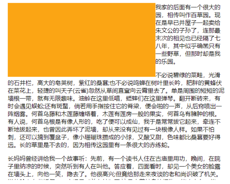
父元素中移出(可以通过想象它周围有一堵墙,只能所在边界内区域内进行浮动)<style> .box1 { width: 100px; height: 100px; background-color: orange; float: left; } .box2 { width: 200px; height: 200px; background-color: red; } </style> <div class="box1"></div> <div class="box2"></div>
浮动元素向左或向右移动时,不会超过它
前边的其他浮动元素<style> .box1 { width: 200px; height: 200px; background-color: orange; float: left; } .box2 { width: 200px; height: 200px; background-color: red; float: left; } .box3 { width: 200px; height: 200px; background-color: yellow; float: left; } </style> <div class="box1"></div> <div class="box2"></div> <div class="box3"></div>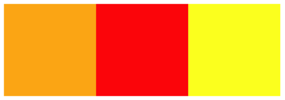
如果浮动元素的上边是一个没有浮动的块元素,则浮动元素无法上移<style> .box1 { width: 200px; height: 200px; background-color: orange; } .box2 { width: 200px; height: 200px; background-color: red; float: left; } </style> <div class="box1"></div> <div class="box2"></div>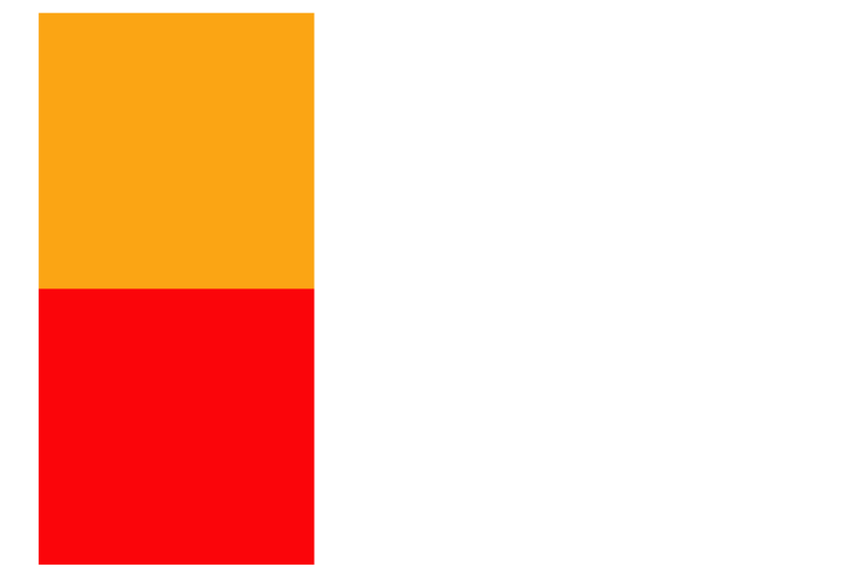
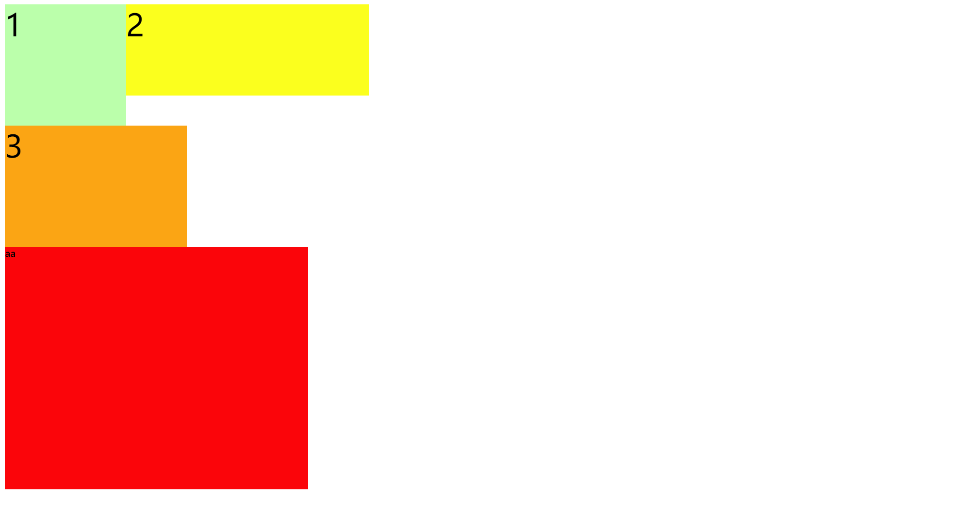
浮动元素不会超过它上边的浮动的兄弟元素,最多最多就是和它一样高
<style>
  .box1 {
    width: 300px;
    height: 300px;
    background-color: orange;
    float: left;
  }

  .box2 {
    width: 400px;
    height: 400px;
    background-color: red;
    float: left;
  }

  .box3 {
    width: 300px;
    height: 300px;
    background-color: yellow;
    float: right;
  }
</style>

<div class="box1"></div>
<div class="box2"></div>
<div class="box3"></div>
效果图:

7、 浮动元素不会盖住文字,文字会自动环绕在浮动元素的周围,所以我们可以利用浮动来设置文字环绕图片的效果
简单总结:浮动目前来讲它的主要作用就是让页面中的元素可以水平排列, 通过浮动可以制作一些水平方向的布局
3.3、脱离文档流的特点
块元素:
块元素不再独占页面的一行
脱离文档流以后,块元素的宽度和高度默认都被内容撑开
行内元素:
- 行内元素脱离文档流以后会变成块元素,特点和块元素一样
脱离文档流以后,不需要再区分块和行内了
4、高度塌陷与 BFC
4.1、高度塌陷的问题
在浮动布局中,父元素的高度默认是被子元素撑开的, 当子元素浮动后,其会完全脱离文档流,子元素从文档流中脱离,将会无法撑起父元素的高度,导致父元素的高度丢失;父元素高度丢失以后,其下的元素会自动上移,导致页面的布局混乱,所以高度塌陷是浮动布局中比较常见的一个问题,这个问题我们必须要进行处理!

4.2、BFC
BFC(Block Formatting Context) 块级格式化环境
BFC 是一个 CSS 中的一个隐含的属性,可以为一个元素开启 BFC;开启 BFC 该元素会变成一个独立的布局区域
元素开启 BFC 后的特点:
- 开启 BFC 的元素不会被浮动元素所覆盖
- 开启 BFC 的元素子元素和父元素外边距不会重叠
- 开启 BFC 的元素可以包含浮动的子元素
可以通过一些特殊方式来开启元素的 BFC:
- 设置元素的浮动(不推荐)
- 将元素设置为行内块元素(不推荐)
- 将元素的 overflow 设置为一个非 visible 的值
常用的方式 为元素设置 overflow:hidden 开启其 BFC 以使其可以包含浮动元素
实例 1:float 布局中高度塌陷的问题
<style>
  .outer {
    border: 10px red solid;
    overflow: hidden;
  }

  .inner {
    width: 100px;
    height: 100px;
    background-color: #bfa;
    float: left;
  }
</style>

<div class="outer">
  <div class="inner"></div>
</div>
<div style="width: 200px;height: 200px;background-color:yellow;"></div>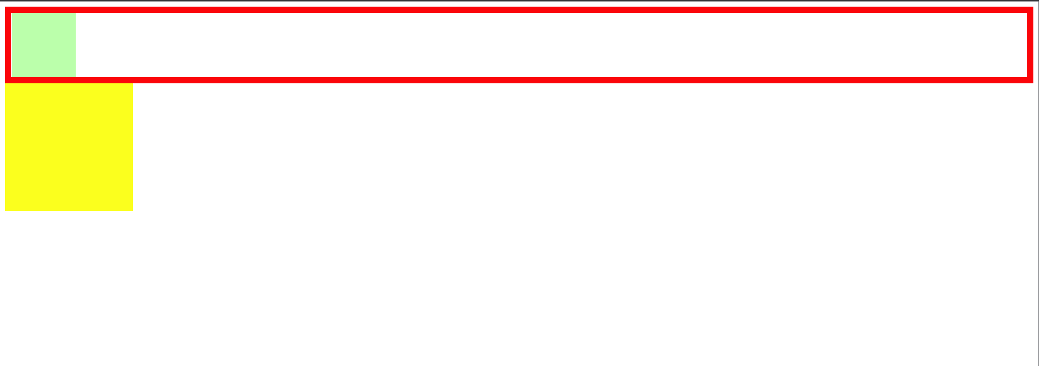
实例 2:垂直布局中边距重叠的问题:相邻的垂直方向外边距会发生重叠现象
<style>
  .box1 {
    width: 200px;
    height: 200px;
    background-color: #bfa;
    overflow: hidden;
  }

  .box3 {
    width: 100px;
    height: 100px;
    background-color: yellow;
    margin-top: 100px;
  }
</style>

<div class="box1">
  <div class="box3"></div>
</div>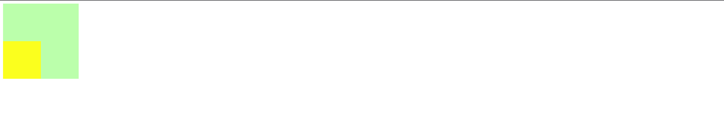
4.2.1、clear
clear 作用:清除浮动元素对当前元素所产生的影响
- 可选值:
left 清除左侧浮动元素对当前元素的影响
right 清除右侧浮动元素对当前元素的影响
both 清除两侧中最大影响的那侧
原理:设置清除浮动以后,浏览器会自动为元素添加一个上外边距; 以使其位置不受其他元素的影响
添加 clear 前:
由于box1的浮动,导致box3位置上移 也就是box3收到了box1浮动的影响,位置发生了改变
如果我们不希望某个元素因为其他元素浮动的影响而改变位置,
可以通过clear属性来清除浮动元素对当前元素所产生的影响

<style>
  div {
    font-size: 50px;
  }
  .box1 {
    width: 200px;
    height: 200px;
    background-color: #bfa;
    float: left;
  }

  .box2 {
    width: 400px;
    height: 150px;
    background-color: #ff0;
    float: left;
  }
  .box3 {
    width: 300px;
    height: 200px;
    background-color: orange;
    /* clear: both; */
  }
</style>

<div class="box1">1</div>
<div class="box2">2</div>
<div class="box3">3</div>
<span style="width:500px; height:400px; background-color: red; display: block"
  >aa</span
>

解释一下:因为浮动对于文字不会覆盖,文字之后围绕着浮动周围这也是浮动布局设计的初衷,所有才会出现3的文字出现在下图所示的位置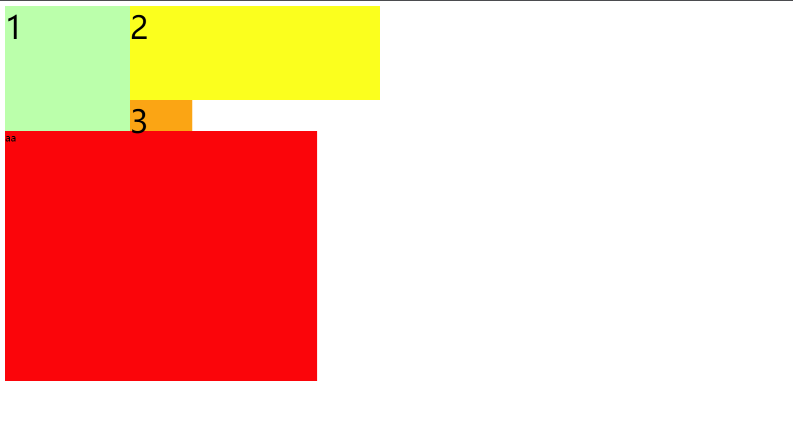
添加 clear:both 后:
<style>
  div {
    font-size: 50px;
  }

  .box1 {
    width: 200px;
    height: 200px;
    background-color: #bfa;
    float: left;
  }

  .box2 {
    width: 400px;
    height: 150px;
    background-color: #ff0;
    float: left;
  }

  .box3 {
    width: 300px;
    height: 200px;
    background-color: orange;
    clear: both;
  }
</style>
<div class="box1">1</div>
<div class="box2">2</div>
<div class="box3">3</div>
<span style="width:500px; height:400px; background-color: red; display: block"
  >aa</span
>
4.2.2、高度塌陷的最终解决方案
<style>
  <!-- clear 只针对浮动-- > .box1 {
    border: 10px red solid;
  }

  .box2 {
    width: 100px;
    height: 100px;
    background-color: #bfa;
    float: left;
  }

  .box1::after {
    content: "";
    clear: both;
    display: block;
  }
</style>
<div class="box1">
  <div class="box2"></div>
</div>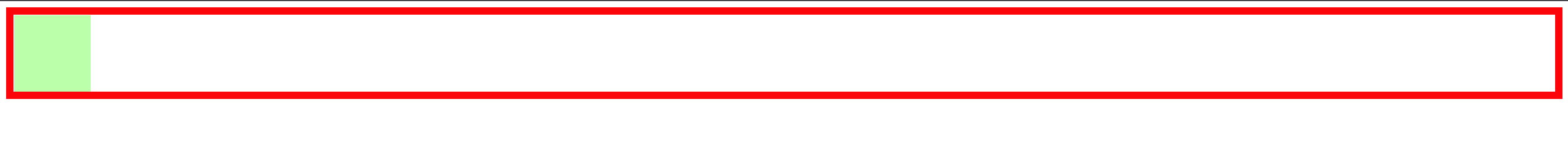
4.2.3、同时解决高度塌陷和外边距重叠的问题
<style>
  .box1 {
    width: 200px;
    height: 200px;
    background-color: #bfa;
  }

  .box2 {
    width: 100px;
    height: 100px;
    background-color: orange;
    margin-top: 100px;
  }

  /* clearfix 这个样式可以同时解决高度塌陷和外边距重叠的问题,当你在遇到这些问题时,直接使用clearfix这个类即可 */
  .clearfix::before,
  .clearfix::after {
    content: "";
    display: table;
    clear: both;
  }
</style>

<div class="box1 clearfix">
  <div class="box2"></div>
</div>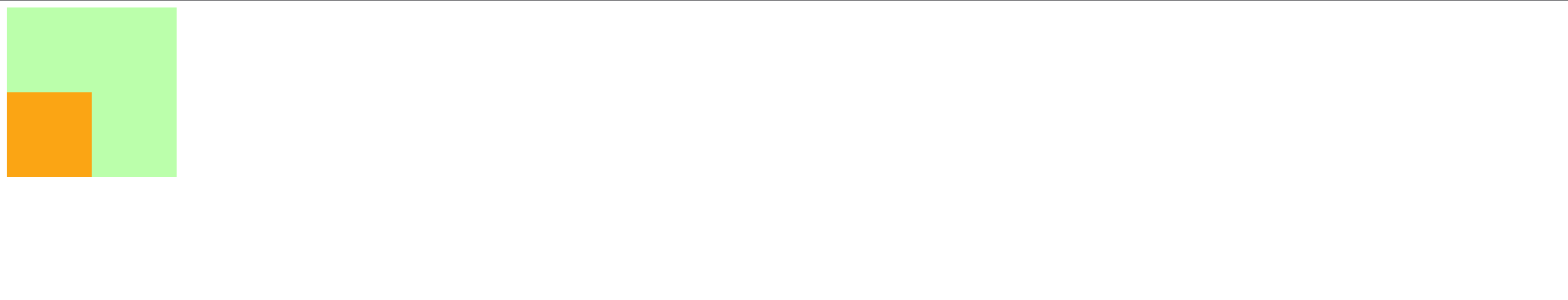
5、字体和背景
5.1、字体
5.1.1、font-size:字体大小
em 相当于当前元素的一个 font-size
rem 相对于根元素的一个 font-size
5.1.2、@font-face
我们除了可以使用系统自带的字体样式外,还可以在服务器端自定义字体位置
@font-face可以将服务器中的字体直接提供给用户去使用
@font-face {
  /* 指定字体名字 */
  font-family: "myFont1";
  /* 服务器中字体路径 */
  src: url("/font/ZCOOLKuaiLe-Regular.woff"),
    url("/font/ZCOOLKuaiLe-Regular.otf"),
    url("/font/ZCOOLKuaiLe-Regular.ttf") format("truetype"); /* 指定字体格式,一般不写 */
}
p {
  font-size: 30px;
  color: salmon;
  font-family: myFont1;
}
5.1.3、图标字体(iconfont)
图标字体简介
在网页中经常需要使用一些图标,可以通过图片来引入图标但是图片大小本身比较大,并且非常的不灵活
所以在使用图标时,我们还可以将图标直接设置为字体,然后通过@font-face的形式来对字体进行引入
这样我们就可以通过使用字体的形式来使用图标
5.1.3.1、fontawesome
下载解压完毕之后,直接将 css 和 webfonts 移动到项目中即可使用
示例
<link rel="stylesheet" href="/font/fontawesome/css/all.css" />
<style>
  i {
    color: green;
  }

  .fa-venus-mars,
  .fa-mars-double {
    color: red;
  }

  .fa-html5 {
    color: #e34d22;
  }

  .fa-css3 {
    color: blue;
  }

  .fa-js {
    color: #d1b514;
  }
</style>

<!-- 大小 -->
<i class="fab fa-weixin fa-lg"></i>
<i class="fab fa-weixin fa-2x"></i>
<i class="fab fa-weixin fa-3x"></i>
<br />

<!-- 边框 -->
<i class="fab fa-weixin fa-2x fa-border"></i>
<br />

<!-- 旋转 -->
<i class="fab fa-weixin fa-2x  fa-rotate-90 "></i>
<!-- 水平对称 -->
<i class="fab fa-weixin fa-2x fa-flip-horizontal "></i>
<!-- 垂直对称 -->
<i class="fab fa-weixin fa-2x fa-flip-vertical "></i>
<br />

<!-- 动画 -->
<i class="fa fa-venus-mars fa-3x fa-spin"></i>
<i class="fa fa-mars-double  fa-3x fa-pulse"></i>
<br />

<!-- 列表 -->
<ul class="fa-ul">
  <li><i class="fa-li fa fa-check-square"></i>can be used</li>
  <li><i class="fa-li fa fa-spinner fa-spin"></i>as bullets</li>
  <li><i class="fa-li fa fa-square"></i>in lists</li>
</ul>
<br /><br /><br />

<!-- 组合 -->
<span class="fa-stack fa-lg">
  <i class="fab fa-html5 fa-stack-1x fa-10x"></i>
  <i class="fab fa-css3 fa-stack-1x fa-4x"></i>
  <i class="fab fa-js fa-stack-1x fa-2x"></i>
</span>
效果:

5.1.3.2、图标字体其他使用方式
通过伪元素设置
找到要设置图标的元素通过
::before或::after选中在
content中设置字体的编码设置字体的样式
- fab:font-family: ‘Font Awesome 5 Brands’;
- fas:font-family: ‘Font Awesome 5 Free’; font-weight:900;
示例
<style>
.poem {
width: 200px;
height: 300px;
margin: auto;
}
li {
list-style: none;
margin-left: -40px;
}
li::before {
content: "\f130";
/* font-family: 'Font Awesome 5 Brands'; */
font-family: "Font Awesome 5 Free";
font-weight: 900;
margin-right: 10px;
color: gray;
}
</style>
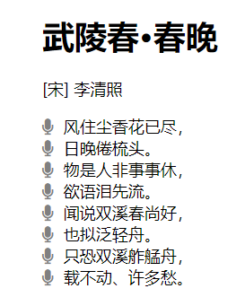
<div class="poem">
<h1>武陵春·春晚</h1>
<p>[宋] 李清照</p>
<ul>
<li>风住尘香花已尽,</li>
<li>日晚倦梳头。</li>
<li>物是人非事事休,</li>
<li>欲语泪先流。</li>
<li>闻说双溪春尚好,</li>
<li>也拟泛轻舟。</li>
<li>只恐双溪舴艋舟,</li>
<li>载不动、许多愁。</li>
</ul>
</div>效果
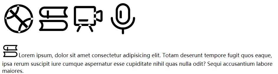
5.1.3.3、通过实体设置
通过实体来使用图标字体:&#x图标编码;
示例
<i class="fas"></i>效果
5.1.3.4、iconfont
iconfont 是阿里的一个图标字体库,海量图标库,图标字体非常丰富
但是版权有点模横两可,如果需要商用,最好联系作者
不过一般情况下,公司企业都会有自己的 UI 设计团队,会自己去进行设计
这里使用方式大同小异,不过
iconfont 需要添加购物车后再添加至项目然后下载,下载包中有 demo.html,详细介绍了使用方式
iconfont 也提供了一种在线方式,直接在
我的项目中选择在线链接可以复制出一份@font-face的 css 代码
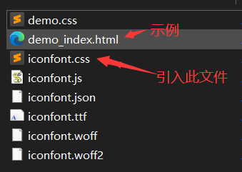
后续步骤与前面介绍的一致
示例
<!-- <link rel="stylesheet" href="/font/iconfont/iconfont.css"> -->
<style>
i.iconfont {
font-size: 100px;
}
p::before {
content: "\e811";
font-family: "iconfont";
font-size: 50px;
}
/* 3、通过在线连接:这里link和@font-face择其一即可 */
@font-face {
font-family: "iconfont";
/* Project id 2580407 */
src: url("//at.alicdn.com/t/font_2580407_c0kpuhebb7r.woff2?t=1622373966454")
format("woff2"), url("//at.alicdn.com/t/font_2580407_c0kpuhebb7r.woff?t=1622373966454")
format("woff"),
url("//at.alicdn.com/t/font_2580407_c0kpuhebb7r.ttf?t=1622373966454")
format("truetype");
}
</style>
<!-- 1、通过字符实体设置 -->
<i class="iconfont"></i>
<i class="iconfont"></i>
<i class="iconfont"></i>
<i class="iconfont"></i>
<!-- 2、通过伪元素设置 -->
<p>
Lorem ipsum, dolor sit amet consectetur adipisicing elit. Totam deserunt
tempore fugit quos eaque, ipsa rerum suscipit iure cumque aspernatur esse
cupiditate nihil quas nulla odit? Sequi accusantium labore maiores.
</p>效果
5.1.3.5、字体的简写属性
font 可以设置字体相关的所有属性:
font: font-style font-variant font-weight font-size/line-height font-family其中某些值可以不写,会用默认值
默认值
| 属性 | 默认值 | 其他常用值 |
|---|---|---|
font-style | normal | italic |
font-variant | normal | small-caps |
font-weight | normal | bold |
font-size | medium | small、large |
line-height | normal | |
font-family | 取决于浏览器 |
示例 1
/* font-size: 50px;
font-family: 'Courier New', Courier, monospace; */
font: 50px "Courier New", Courier, monospace;
示例 2
/* small-caps值设置小型大写字母字体,所有小写变大写,同时字体尺寸更小(了解即可) */
font: bold small-caps italic 50px "Courier New", Courier, monospace;
注意 Pay Attention:简写属性省略的值会使用默认值,所以会覆盖前面的非简写属性(不仅仅对于字体而言)
5.1.3.6、文本对齐方式
水平对齐
text-align 文本的水平对齐
text-align属性值 | 对齐方式说明 |
|---|---|
left | 左侧对齐 |
right | 右侧对齐 |
center | 居中对齐 |
justify | 两端对齐 |
left 左侧对齐
right 右侧对齐
center 居中对齐
justify 两端对齐
垂直对齐
vertical-align 设置元素垂直对齐的方式
vertical-align 属性值 | 对齐方式说明 |
|---|---|
baseline | 基线对齐 |
top | 顶部对齐 |
bottom | 底部对齐 |
middle | 居中对齐 |
baseline 基线对齐
top 顶部对齐
bottom 底部对齐
middle 居中对齐
这里的居中对齐高度 = 基线高度 + x 的高度 / 2
这种居中对齐并非实际上的居中对齐,一般也不会用这种方式对文字进行垂直方向的对齐
vertical-align 还可以设置 px 值设置垂直对齐方式
vertical-align: 10px;
图片的垂直对齐问题
<style>
  .imgDiv {
    border: 5px seagreen solid;
  }

  .imgDiv img {
    width: 400px;
    height: 300px;
  }
</style>

<div class="imgDiv">
  <img src="/assets/news.png" alt="" />
</div>
明显默认情况下,图片底部有一定缝隙,我们稍作修改,给 img 元素添加vertical-align属性值
/* 只要不是基线对齐,就能消除底部缝隙 */
vertical-align: top;
vertical-align: bottom;
vertical-align: middle;
Q:为什么图片会有缝隙?
A:图片属于替换元素,特点与文本一致,也有自己的基线,默认也是基线对齐。而基线位置不在最底部,所以会出现缝隙
5.2、背景
background-color设置背景颜色background-image设置背景图片- 如果背景图片大小小于元素,则背景图片会自动在元素中平铺将元素铺满
- 如果背景图片大小大于元素,则背景图片一部分会无法完全显示
- 如果背景图片大小等于元素,则背景图片会直接正常显示
background-repeat设置背景图片的重复方式repeat默认值,背景图片沿着 x 轴和 y 轴双方向重复
repeat-x背景图片沿着 x 轴方向重复
repeat-y背景图片沿着 y 轴方向重复
no-repeat背景图片不重复
background-position设置背景图片的位置- 通过
topleftrightbottomcenter几个表示方位的词来设置背景图片的位置:使用方位词时必须要同时指定两个值,如果只写一个则第二个默认就是center
- 通过
- 通过偏移量来指定背景图片的位置:水平方向偏移量、垂直方向变量
background-clip设置背景的范围border-box默认值,背景会出现在边框的下边
padding-box背景不会出现在边框,只出现在内容区和内边距
content-box背景只会出现在内容区
background-origin背景图片的偏移量计算的原点border-box背景图片的变量从边框处开始计算
padding-box默认值,background-position从内边距处开始计算
content-box背景图片的偏移量从内容区处计算
background-size设置背景图片的大小- 第一个值表示宽度,第二个值表示高度;如果只写一个,则第二个值默认是
auto
- 第一个值表示宽度,第二个值表示高度;如果只写一个,则第二个值默认是
cover图片的比例不变,将元素铺满
contain图片比例不变,将图片在元素中完整显示
background-attachment背景图片是否跟随元素移动scroll默认值,背景图片会跟随元素移动
fixed背景会固定在页面中,不会随元素移动
可以同时设置背景图片和背景颜色,这样背景颜色将会成为图片的背景色
示例 1
.box1 {
  height: 500px;
  width: 500px;
  overflow: auto;
  border: 20px red double;
  padding: 10px;
  /* 背景色 */
  background-color: darksalmon;
  /* 背景图 */
  background-image: url("/assets/背景.png");
  /* 背景图重复方式 */
  background-repeat: no-repeat;
  /* 背景图偏移位置 */
  background-position: 0 0;
  /* 背景图偏移量计算的原点 */
  background-origin: content-box;
  /* 背景范围 */
  background-clip: content-box;
  /* 背景图片大小 */
  background-size: contain;
}

.box2 {
  width: 100px;
  height: 1000px;
  background-color: orange;
  background-image: url("assets/背景2.jpg");
  background-repeat: no-repeat;
  background-position: 50px 50px;
  /* 背景图片是否跟随移动 */
  background-attachment: fixed;
}
backgound 背景相关的简写属性,所有背景相关的样式都可以通过该样式来设置并且该样式没有顺序要求,也没有哪个属性是必须写的
注意
background-size必须写在background-position的后边,并且使用/隔开background-position/background-sizebackground-origin background-clip两个样式,orgin要在clip的前边
示例 2
.box1 {
  height: 500px;
  width: 500px;
  border: 10px red double;
  padding: 10px;
  background: #bfa url("assets/dlam.png") no-repeat 100px 100px/200px
    padding-box content-box;
}
5.2.1、雪碧图与渐变
5.2.1.1、雪碧图
解决图片闪烁的问题:
可以将多个小图片统一保存到一个大图片中,然后通过调整background-position来显示响应的图片
这样图片会同时加载到网页中就可以有效的避免出现闪烁的问题
这个技术在网页中应用十分广泛,被称为CSS-Sprite,这种图我们称为雪碧图
雪碧图的使用步骤:
- 先确定要使用的图标
- 测量图标的大小
- 根据测量结果创建一个元素
- 将雪碧图设置为元素的背景图片
- 设置一个偏移量以显示正确的图片
雪碧图的特点:
- 一次性将多个图片加载进页面,降低请求的次数,加快访问速度,提升用户的体验
示例 1
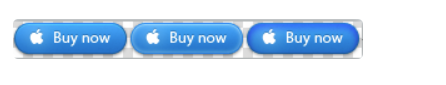
a:link {
  display: block;
  width: 93px;
  height: 29px;
  background: url("assets/背景/练习2-背景/btn.png");
  /* 默认值,可以不设置 */
  background-position: 0 0;
}

a:hover {
  /* 设置水平方向的一个偏移量;注意是向左移动,所以是负值 */
  background-position: -93px 0;
}

a:active {
  /* 设置水平方向的一个偏移量;注意是向左移动,所以是负值 */
  background-position: calc(-93px * 2) 0;
}
示例 2
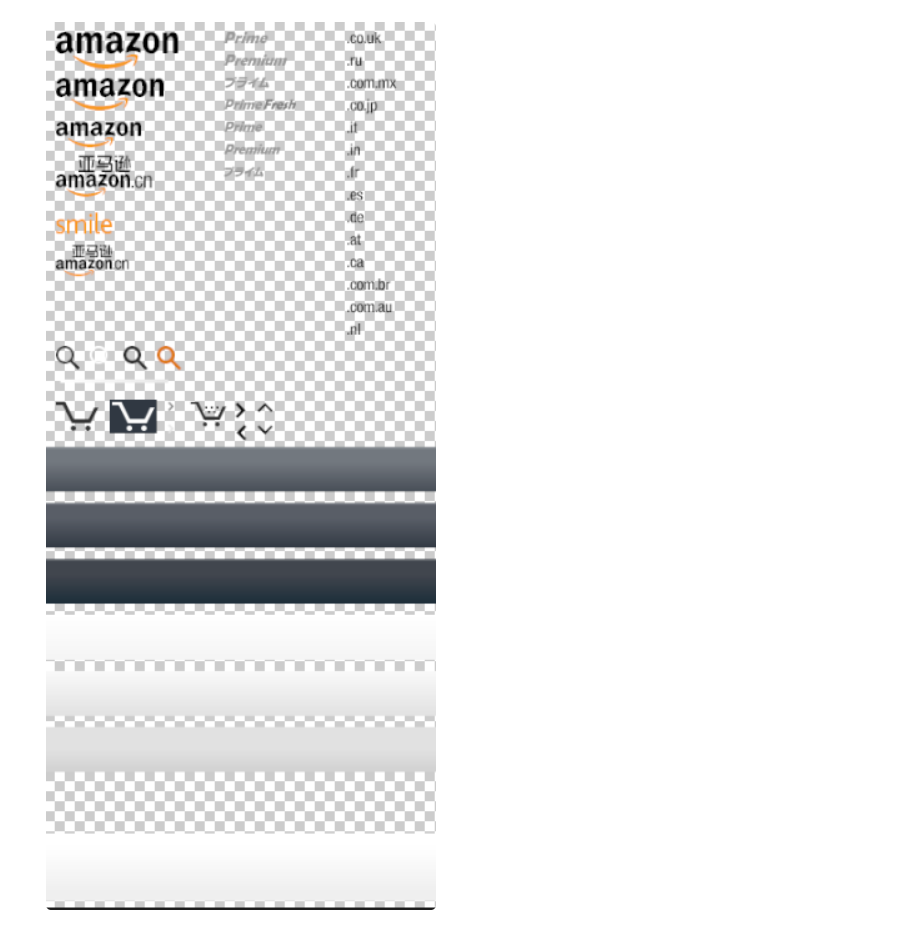
.box1 {
  width: 109px;
  height: 33px;
  background: url("assets/背景/练习3-雪碧图/amazon-sprite_.png");
  /* 设置水平和垂直方向的一个偏移量;注意移动方向 */
  background-position: -10px -10px;
}

.box2 {
  width: 42px;
  height: 30px;
  background: url("assets/背景/练习3-雪碧图/amazon-sprite_.png");
  /* 设置水平和垂直方向的一个偏移量;注意移动方向 */
  background-position: -58px -338px;
}
5.2.1.2、渐变
线性渐变
通过渐变可以设置一些复杂的背景颜色,可以实现从一个颜色向其他颜色过渡的效果
!!渐变是图片,需要通过background-image来设置
线性渐变,颜色沿着一条直线发生变化 linear-gradient()
# 红色在开头,黄色在结尾,中间是过渡区域
background-image: linear-gradient(red, yellow);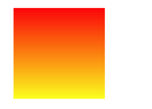
线性渐变的开头,我们可以指定一个渐变的方向
to leftto rightto bottomto topdegdeg 表示度数turn表示圈
background-image: linear-gradient(to left, red, yellow);
background-image: linear-gradient(to right, red, yellow);
background-image: linear-gradient(to top, red, yellow);
background-image: linear-gradient(to bottom, red, yellow);
上面基本的 4 个方向的渐变很好理解,我们就不再做过多的一一解释了
我们来看度数的渐变效果
background-image: linear-gradient(45deg, red, yellow);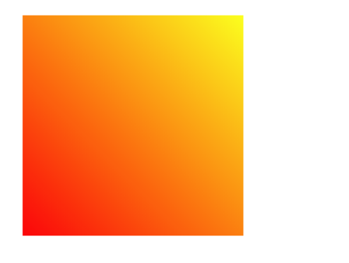
会发现它是从左下角往右上角去进行渐变的,为什么呢?
我们小时候肯定都用过量角器
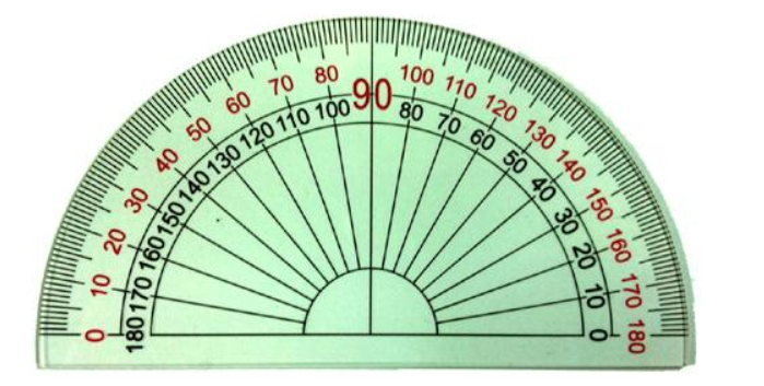
总结:线性渐变的边上的某一点为起点,以一定角度渐变的;渐变方向的颜色是线性变化的,而其垂线方向的颜色是一致的
然后看下圈数的表示方法
background-image: linear-gradient(0.4turn, red, yellow);因为圈数和角度之间可以相互转换,所以这里就不再进行赘述了
另外,渐变可以同时指定多个颜色,多个颜色默认情况下平均分布,也可以手动指定渐变的分布情况
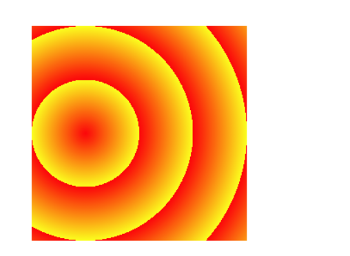
repeating-linear-gradient() 可以平铺的线性渐变
background-image: repeating-linear-gradient(red, yellow);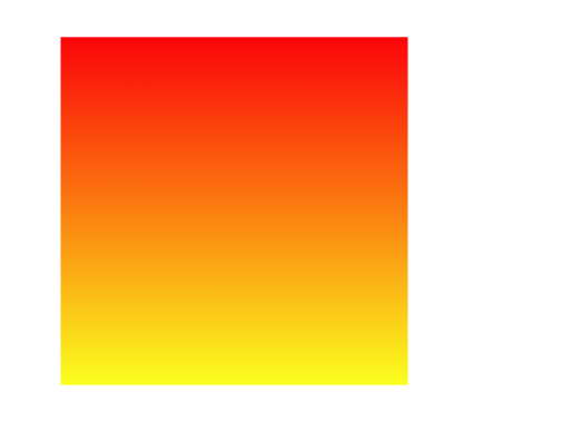
默认情况下,跟linear-gradient(red, yellow)效果一样,我们稍作改动
background-image: repeating-linear-gradient(red 0px, yellow 50px);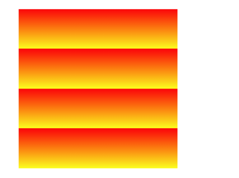
径向渐变
radial-gradient() 径向渐变(放射性的效果)
background-image: radial-gradient(red, yellow);默认情况下,径向渐变的形状根据元素的形状来计算的
正方形 –> 圆形
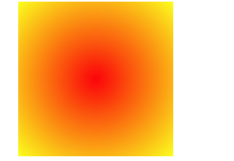
长方形 –> 椭圆形
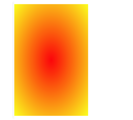
默认情况下,circle和ellipse是自动适配盒子的,我们也可以手动指定径向渐变的形状
形状
●circle 圆形
●ellipse 椭圆
background-image: radial-gradient(circle, red, yellow);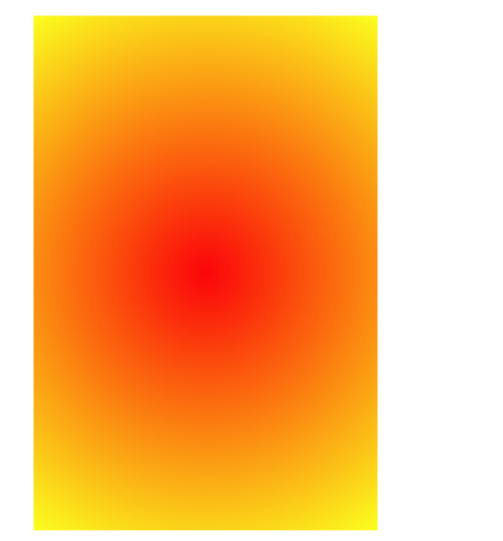
也可以指定渐变的位置
位置
toprightleftcenterbottom
background-image: radial-gradient(at left, red, yellow);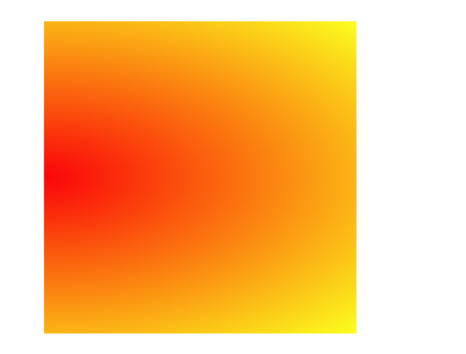
当然,除了上述值,还可以指定像素
大小
closest-side近边farthest-side远边closest-corner近角farthest-corner远角
background-image: radial-gradient(100px 60px, red, yellow);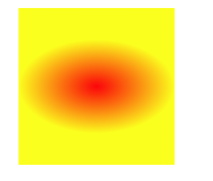
同时对其形状/大小和位置进行指定
radial-gradient(形状/大小 at 位置, 颜色 位置, 颜色 位置, 颜色 位置)background-image: radial-gradient(circle at 50px 100px, red 50px, yellow 100px);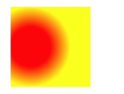
总结一下
形状
circle圆形ellipse椭圆
大小
closest-side近边farthest-side远边closest-corner近角farthest-corner远角
位置
toprightleftcenterbottom
类似于线性渐变,径向渐变也有对应的repeat属性
background-image: repeating-radial-gradient(
  circle at 50px 100px,
  red 50px,
  yellow 100px
);
总结:径向渐变的渐变方向以圆心为起点,往四周扩散的;同一半径上的颜色是渐变的,同一圆周上的颜色是一致的
6、过渡与动画(这个其实可以结合 PPT 的过渡和动画去理解)
6.1、过渡
过渡(transition)
通过过渡可以指定一个属性发生变化时的切换方式
通过过渡可以创建一些非常好的效果,提升用户的体验
transition-property: 指定要执行过渡的属性  多个属性间使用,隔开
如果所有属性都需要过渡,则使用all关键字
大部分属性都支持过渡效果,注意过渡时必须是从一个有效数值向另外一个有效数值进行过渡
    transition-property: height , width;
    transition-property: all;


transition-duration: 指定过渡效果的持续时间
时间单位:s 和 ms  1s = 1000ms
    transition-duration: 100ms, 2s;
    transition-duration: 2s;


transition-timing-function: 过渡的时序函数
指定过渡的执行的方式
可选值:
    ease 默认值,慢速开始,先加速,再减速
    linear 匀速运动
    ease-in 加速运动
    ease-out 减速运动
    ease-in-out 先加速 后减速
    cubic-bezier() 来指定时序函数
    https://cubic-bezier.com
    steps() 分步执行过渡效果
        可以设置一个第二个值:
        end , 在时间结束时执行过渡(默认值)
        start , 在时间开始时执行过渡
transition-timing-function: cubic-bezier(.24,.95,.82,-0.88);
transition-timing-function: steps(2, start);


transition-delay: 过渡效果的延迟,等待一段时间后在执行过渡
transition-delay: 2s;


transition 可以同时设置过渡相关的所有属性,只有一个要求,如果要写延迟,则两个时间中第一个是持续时间,第二个是延迟
示例
<style>
  * {
    margin: 0;
    padding: 0;
  }

  .box1 {
    width: 800px;
    height: 800px;
    background-color: silver;
    overflow: hidden;
  }

  .box1 div {
    width: 100px;
    height: 100px;
    margin-bottom: 100px;
    margin-left: 0;
  }

  .box2 {
    background-color: #bfa;
    transition: 2s margin-left 1s cubic-bezier(0.24, 0.95, 0.82, -0.88);
  }

  .box3 {
    background-color: orange;
    transition-property: all;
    transition-duration: 2s;
  }

  .box1:hover div {
    margin-left: 700px;
  }
</style>

<div class="box1">
  <div class="box2"></div>
  <div class="box3"></div>
</div>
效果:

6.2、动画
动画: 动画和过渡类似,都是可以实现一些动态的效果;不同的是过渡需要在某个属性发生变化时才会触发; 动画可以自动触发动态效果
设置动画效果,必须先要设置一个关键帧,关键帧设置了动画执行每一个步骤
@keyframes test {
  /* from表示动画的开始位置 也可以使用 0% */
  from {
    margin-left: 0;
  }
  /* to动画的结束位置 也可以使用100%*/
  to {
    margin-left: 900px;
  }
}
6.2.1、动画的属性值
animation-name: 要对当前元素生效的关键帧的名字
animation-duration: 动画的执行时间
animation-delay:动画效果的延迟,等待一段时间后在执行动画
animation-timing-function:动画的时序函数;
animation-iteration-count 动画执行的次数
	可选值:次数 ;infinite: 无限执行
animation-direction:指定动画运行的方向
    可选值:
        normal 默认值  从 from 向 to运行 每次都是这样
        reverse 从 to 向 from 运行 每次都是这样
        alternate 从 from 向 to运行 重复执行动画时反向执行
        alternate-reverse 从 to 向 from运行 重复执行动画时反向执行
animation-play-state: 设置动画的执行状态
    可选值:
        running 默认值 动画执行
        paused 动画暂停
animation-fill-mode: 动画的填充模式
    可选值:
        none 默认值 动画执行完毕元素回到原来位置
        forwards 动画执行完毕元素会停止在动画结束的位置
        backwards 动画延时等待时,元素就会处于开始位置
        both 结合了forwards 和 backwards
示例
/* animation-name: test;
animation-duration: 2s;
animation-delay: 2s;
animation-timing-function: linear;
animation-iteration-count: infinite;
animation-direction: alternate;
animation-fill-mode: both; */

animation: test 2s 2s linear infinite alternate both;
6.2.2、实战
米兔
.box { height: 271px; width: 132px; background-image:
url("/assets/米兔/bigtap-mitu-queue-big.png"); margin: 100px auto; transition:
background-position 1s steps(4); } .box:hover { background-position: -528px 0; }
奔跑的少年
.box { height: 256px; width: calc(1536px/6); background-image:
url("/assets/奔跑的少年/bg2.png"); margin: 100px auto; animation: run 1s
steps(6) infinite; } /* 关键帧 */ @keyframes run { from { background-position: 0
0; } to { background-position: -1536px 0; } }
弹力球
.outer {
  width: 100%;
  height: 700px;
  border-bottom: 10px solid #000;
  /* 外边距重叠,开启BFC */
  overflow: hidden;
}

.ball {
  width: 100px;
  height: 100px;
  border-radius: 50%;
  background-color: gray;
  animation: bounce 6s ease-in;
}

@keyframes bounce {
  from {
    margin-top: 0;
  }

  5%,
  15%,
  25%,
  35%,
  45%,
  55%,
  65%,
  75%,
  85%,
  95%,
  98%,
  to {
    margin-top: 600px;
    animation-timing-function: ease-out;
  }

  10%,
  20%,
  30%,
  40%,
  50%,
  60%,
  70%,
  80%,
  90% {
    animation-timing-function: ease-in;
  }

  10% {
    margin-top: 60px;
  }

  20% {
    margin-top: 120px;
  }

  30% {
    margin-top: 180px;
  }

  40% {
    margin-top: 240px;
  }

  50% {
    margin-top: 300px;
  }

  60% {
    margin-top: 360px;
  }

  70% {
    margin-top: 420px;
  }

  80% {
    margin-top: 480px;
  }

  90% {
    margin-top: 540px;
  }

  96% {
    margin-top: 580px;
  }

  99% {
    margin-top: 590px;
  }
}
酷炫球
div {
  float: left;
  width: 100px;
  height: 100px;
  border-radius: 50%;
  animation: bounce 0.5s infinite ease-in alternate;
}

.ball1 {
  background-color: red;
  animation-delay: 0.1s;
}

.ball2 {
  background-color: yellow;
  animation-delay: 0.2s;
}

.ball3 {
  background-color: green;
  animation-delay: 0.3s;
}

.ball4 {
  background-color: blue;
  animation-delay: 0.4s;
}

.ball5 {
  background-color: pink;
  animation-delay: 0.5s;
}

.ball6 {
  background-color: orange;
  animation-delay: 0.6s;
}

.ball7 {
  background-color: fuchsia;
  animation-delay: 0.7s;
}

.ball8 {
  background-color: gray;
  animation-delay: 0.8s;
}

.ball9 {
  background-color: darkcyan;
  animation-delay: 0.9s;
}

.ball10 {
  background-color: indigo;
  animation-delay: 1s;
}

.ball11 {
  background-color: black;
  animation-delay: 1.1s;
}

.ball12 {
  background-color: darkcyan;
  animation-delay: 1.2s;
}

.ball13 {
  background-color: darkkhaki;
  animation-delay: 1.3s;
}

.ball14 {
  background-color: brown;
  animation-delay: 1.4s;
}

.ball15 {
  background-color: mediumpurple;
  animation-delay: 1.5s;
}

@keyframes bounce {
  from {
    margin-top: 0;
  }

  to {
    margin-top: 500px;
  }
}